Article
July 24, 2025
•
2
mins
How Accessibility Fuels User Loyalty and Impacts Online Payments
By


Inclusive and accessible design should be a priority for every stage of the user journey, including the payment experience. Inaccessible interfaces can frustrate users, particularly older demographics and individuals with visual, motor, or cognitive impairments. By incorporating a frictionless design, merchants can remove barriers, build trust, and empower more users to complete transactions confidently.
Your payment experience is a key moment of truth. It’s where interest becomes action, and hesitation can lead to abandonment. Accessibility best practices benefit not only users with disabilities, but also create a smoother experience for all customers. And the impact is measurable.
Clear, accessible payment flows can lead to:
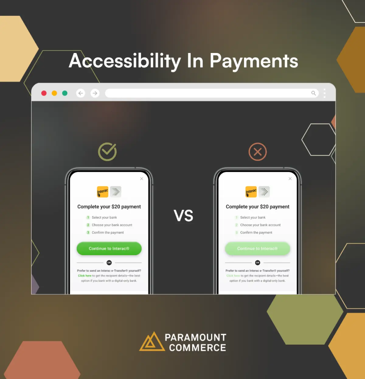
Paramount’s branding feature provides merchants with the option to upload a brand logo, turn on dark mode, and apply primary/background colors to match their overall brand personality. Utilizing these settings can support payment flow accessibility, so here are some quick guidelines to help ensure a user-friendly experience:

Create contrast: Avoid light colors on light backgrounds and dark colors on darker backgrounds.
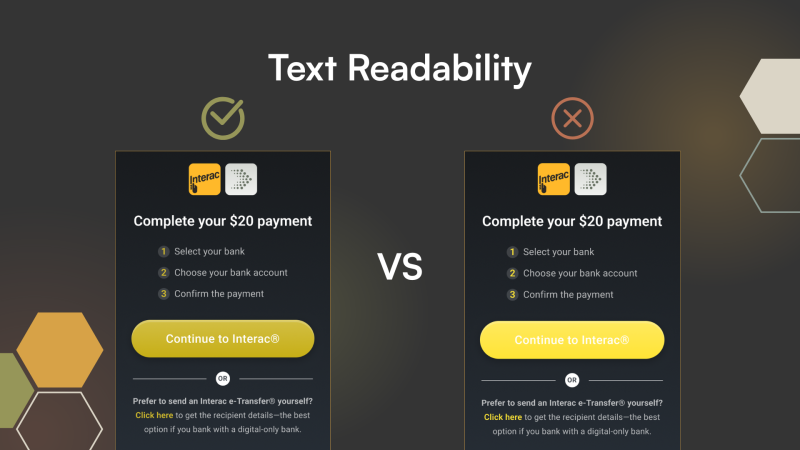
Text readability: Ensure white text is readable against your background color. Don’t use any light colors for the primary color, keep a contrast.
Light vs. Dark Mode: Select a theme that best reflects your online branding to create a seamless experience that does not disrupt the user flow
The Canadian market is diverse, aging, and increasingly digital. The merchants who succeed will be the ones who meet every user where they are. Going forward as your team optimizes your platform, it’s important to ask ‘is this experience built for everyone?’.
Need help customizing your payment flow? Reach out to your Account Manager for additional support.
Fintech trends and insights,
explained in 5 minutes or less

Fintech trends and insights,
explained in 5 minutes or less